
Data is, quite simply, everywhere. It’s estimated that 328.77 million terabytes of data are created each day. No comparison would truly put that into any kind of useful perspective – but I’m sure you get the picture.
As an industry leading EHS software provider, we’re more aware of this than most. Our industry is flooded with data. Coming from more sources than ever before thanks to digitization projects, the introduction of wearables into more workspaces, and better understanding of the power of data analytics.
In this article, we’re going to talk about one of the easiest ways to capitalize on the data available to EHS professionals; a data visualization dashboard. We’ll discuss what it is, the stories it can help you tell, and give some recommendations on what makes the perfect EHS data visualization dashboard.
What is an EHS data visualization dashboard?
Many will be familiar with what a dashboard is within a software platform. For many, it’s a launch pad or homepage – the place they kick off their journey within the software at any given time. Many Cority users customize their Advanced Dashboard with tasks requiring certain users’ attention, information on audits, and more.
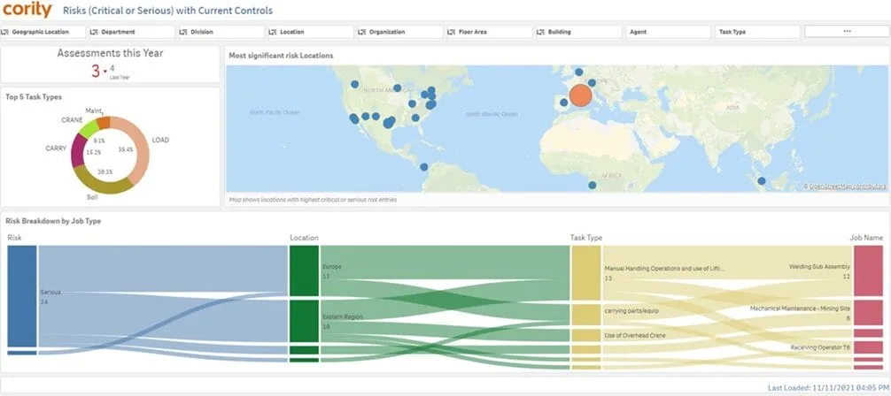
The difference with a data visualization dashboard is the specific role, which is as simple as the name suggests. A data visualization dashboard is a place that helps users to visualize their data. For example, the visual below shows an organization’s risk assessment data in a number of ways; a map to show geography, tasks that result in risk, and more.
We’ve previously spoken about Data Literacy, and what software providers can do to assist in making data more accessible for a wider audience. Ultimately, data visualization dashboards can do exactly this – giving users the ability to see and understand data quickly.
How is data visualization different from data analytics?
Think of data visualization as one aspect of analytics. The purpose of a visualization dashboard is to simply show a user their data in the simplest way to make discovery. For example, a site manager in Albany would have no use for a dashboard that only had their data in one corner of the screen – but an executive may want to see data from across all geographies.
This user-centricity is something we’ll discuss in depth later – but for now, the distinction we should underline is that where analytics can help dive deeper into data to the nth degree, visualization is only concerned with showing the data upfront and making top-level discovery easy.
What should be included? Depends on your user!
If you want your data visualization dashboard to be useful, the number one thing to remember is who your end user is. As alluded to above, our Albany site manager wouldn’t be particularly taken with a dashboard all about New Zealand – so why would we show them that data? It’s a simple takeaway, but important, nonetheless.
This isn’t to say that administrators need to create unique dashboards for every single user type within their organization. While the gold standard is to enable everyone with something completely customized to their needs – you can often design dashboards that give several users what they need with minimal manual editing.
For example – organizations with multiple sites could utilize the same dashboard and drill down to their own site with a single click on tools like the CorAnalytics dashboard shown above. Alternatively, providing users with very simple instructions on how to edit their filters to show the data that is important to them can often be an easy way to reduce administrative effort.
What data is recommended for an EHS data visualization dashboard?
Online material so often points to the almost mythical ‘complete view’ of EHS data visualization dashboards. The difficulty behind gaining a complete view is numerous but can be summarized as follows; a complete view is a lot of things to a lot of people.
We’ll drill our key message home once more; trying to build one dashboard to appeal to everyone will result in a very big dashboard that’s likely difficult to use! So – simply decide what it is you want to show on your dashboard and stick to it.
Ask yourself which metrics match the purpose of your dashboard. Some examples of safety metrics you could decide to include are;
- Audits and inspections
- Corrective actions
- Days lost
- Incident type
- Injury rate
- Near misses
- Number of incidents
- Root cause analysis, or;
- Type of incident
Instead of cramming in every single one of these metrics, ask yourself which ones are the most important metrics. A maximum of 8 reports across a two-sheet dashboard is usually plenty. From here, you can give users the option to drill down if they want more information.
Final Thoughts
A data visualization dashboard is a place that helps users to visualize their data. A successful dashboard allows the user to see the data they need and make discoveries quickly. Too many metrics in the EHS data visualization dashboard, may lead to complications and something the organization struggles to use!